Building an Interior Design Website with Modern Web Technologies

Sali Memish
Frontend Developer
Date: Sep - 25
After spending a year working with Vue.js, it’s great to be back using React. I recently had the opportunity to build a responsive, multi-language interior design website. In addition to developing the website, I also took on the role of UX/UI designer.Some of the core UX/UI principles I applied include:
UX/UI Principles Applied
- Consistency - Maintaining uniform design elements to reduce confusion and create a predictable user flow
- Clarity - Ensuring that all elements are easy to understand and interact with
- Simplicity - Avoiding unnecessary elements to create a clean and functional interface
- Visual Hierarchy - Organizing content in a way that guides users through the page, highlighting the most important elements
- Accessibility - Designing with all users in mind, including those with disabilities, by ensuring readable fonts and color contrasts
- Responsiveness - Optimizing the design for different devices to provide a seamless experience across desktops, tablets, and smartphones
Tech Stack
I chose a modern tech stack that ensured scalability, ease of maintenance, and a smooth user experience:
- React: The backbone of the project, React allowed me to create reusable components such as image sliders, customer review sections, and a stepper for design stages
- Tailwind CSS: I used Tailwind CSS for styling, which made it easy to build a clean, responsive UI with utility-first classes
- Formik: Form handling was managed using Formik. This was crucial for the contact form, ensuring seamless user input validation and easy integration with other services
- EmailJS: Without a backend team, I used EmailJS to send form submissions directly to my email, simplifying communication with users
- i18next: To reach a wider audience, I added multi-language support using i18next, enabling users to switch between English and Turkish
- Material UI: Material UI components were integrated into the app for consistency and ease of use, including cards, AppBar, and image lists
Key Features
Here are some of the key features I implemented in this project:
- Responsive Design: The site is fully responsive, providing a seamless experience on desktop, tablet, and mobile devices. I used Tailwind's responsive utilities to ensure smooth layouts across different screen sizes.
- Interactive Components: From image sliders that showcase various design styles to a dynamic contact form, the website is built with user interaction in mind.
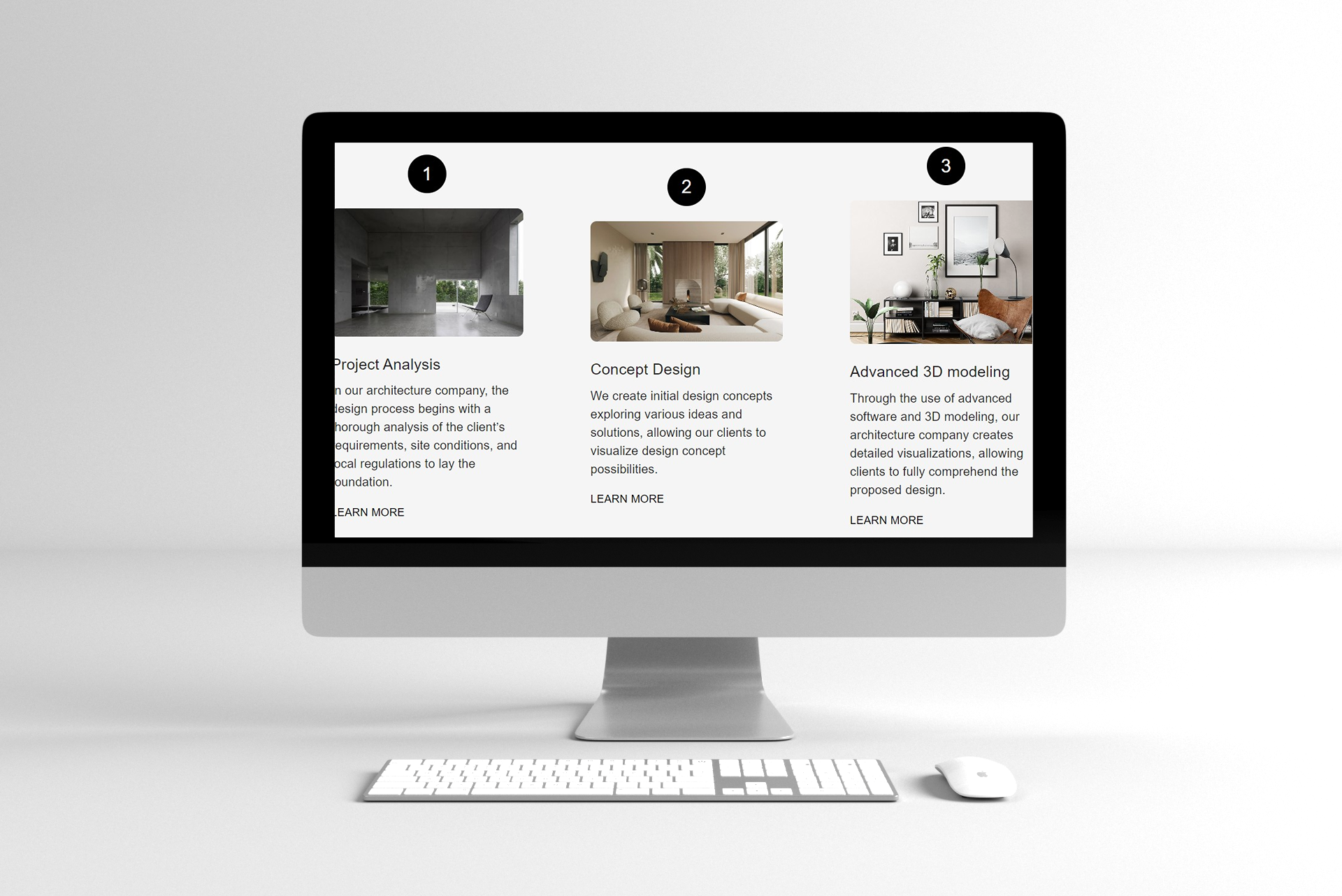
- Step Navigation: A stepper component guides users through the design process, from concept design to advanced 3D modeling, with each step visually represented.
This project helped me deepen my understanding of several technologies. EmailJS simplified form handling without a backend. The multi-language feature through i18next also helped me improve the website’s accessibility.
Deployment
Deployed on Netlify with smooth CI/CD integration, which provided a smooth, continuous integration process. Each time I pushed a new update to the main branch, it was automatically deployed, keeping the workflow streamlined.
If you're working on a similar project or have ideas to improve coding practices, feel free to reach out! I’m always open to exchanging insights, learning from others, or offering help with any challenges you may face.
Blogs
Sep
25
Building an Interior Design Website with Modern Web Technologies
Author
Jan
30
Dec
12
Comming soon
Comming soon new blog about development and coding
Comming soon
Author